The Psychology of Color And Design
Color and design deeply influence human emotions and behaviors. They play a crucial role in marketing and branding strategies.
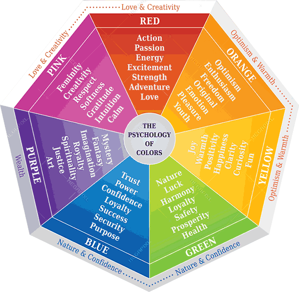
The psychology of color and design is essential for creating impactful visuals. Different colors evoke various emotional responses. For instance, blue often induces calmness, while red can stimulate excitement and urgency. Effective design harmonizes these colors to enhance user experience and brand identity.
Businesses leverage these principles to attract and retain customers. A well-thought-out color scheme and design can significantly boost engagement and conversion rates. Understanding the psychological impact of color and design helps in crafting compelling and persuasive visual content. This knowledge is invaluable for marketers, designers, and anyone looking to make a lasting impression.
Credit: webtech.com.bd
Introduction To Color Psychology
Color psychology helps us understand how colors affect our emotions. Colors can influence our mood, behavior, and decision-making. Designers use color psychology to create visually appealing and effective designs. Knowing the effects of different colors can improve your designs.
The Basics Of Color Theory
Color theory is the study of how colors mix and interact. It involves the color wheel, primary, secondary, and tertiary colors.
- Primary Colors: Red, blue, and yellow. These cannot be created by mixing other colors.
- Secondary Colors: Green, orange, and purple. These are made by mixing primary colors.
- Tertiary Colors: These are created by mixing primary and secondary colors.
The color wheel helps designers choose harmonious color schemes. There are several types of color schemes:
- Complementary: Colors opposite each other on the wheel.
- Analogous: Colors next to each other on the wheel.
- Triadic: Three colors evenly spaced around the wheel.
Historical Significance Of Colors
Colors have different meanings in various cultures. Over time, these meanings have evolved. Here are some examples:
| Color | Historical Significance |
|---|---|
| Red | Represents love, passion, and danger. In some cultures, it symbolizes good luck. |
| Blue | Often associated with calm, trust, and stability. In ancient Egypt, it represented the sky and water. |
| Green | Symbolizes nature, growth, and renewal. In medieval times, it was the color of fertility. |
| Yellow | Represents happiness and energy. In some cultures, it is the color of mourning. |
Impact Of Color On Emotions
The colors around us have a powerful impact on our emotions. They can influence our mood, feelings, and even behaviors. Understanding the psychology of color can help in creating effective designs that evoke desired emotional responses.
Warm Vs Cool Colors
Warm colors like red, orange, and yellow can evoke feelings of warmth and comfort. They can also create excitement and energy. These colors are often used to grab attention and stimulate enthusiasm.
Cool colors such as blue, green, and purple tend to have a calming effect. They are associated with tranquility and relaxation. Cool colors are often used in spaces designed for rest and reflection.
| Warm Colors | Cool Colors |
|---|---|
| Red, Orange, Yellow | Blue, Green, Purple |
| Excitement, Energy, Warmth | Calm, Relaxation, Tranquility |
Cultural Influences On Color Perception
Color perception varies across different cultures. What one culture sees as positive, another might view differently. Understanding these cultural differences is crucial in design.
- In Western cultures, white often symbolizes purity and peace.
- In some Eastern cultures, white represents mourning and death.
- Red is a color of luck and celebration in China.
- In Western cultures, red can signify danger or passion.
Knowing these cultural contexts helps in creating designs that resonate globally. It ensures your message is received as intended.
Color In Branding
Color plays a crucial role in branding. It shapes how consumers perceive your brand. The right color choice can create a strong emotional connection. Brands use colors to convey specific messages and evoke feelings.
Building Brand Identity
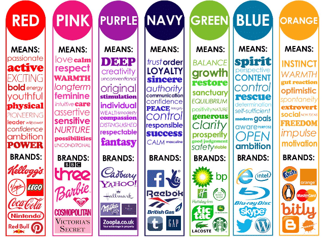
A well-chosen color palette can significantly impact brand identity. Colors help distinguish brands in a crowded market. For instance, blue often signifies trust and professionalism. Many financial institutions use blue in their logos. On the other hand, red can evoke excitement and passion. Brands like Coca-Cola use red to grab attention.
Case Studies Of Successful Brands
Let’s look at some case studies of successful brands and their color choices.
| Brand | Color | Message/Emotion |
|---|---|---|
| McDonald’s | Red and Yellow | Happiness and Excitement |
| Starbucks | Green | Relaxation and Growth |
| Apple | Gray and White | Elegance and Simplicity |
McDonald’s uses red and yellow to evoke happiness and excitement. The vibrant colors make the brand more appealing, especially to children. Starbucks uses green to symbolize relaxation and growth. The color aligns with their mission of sustainability. Apple opts for gray and white, signifying elegance and simplicity. This minimalist approach speaks to their high-end market.
Color In Interior Design
Color plays a crucial role in interior design. It affects our emotions and sets the tone of a room. Choosing the right colors can transform a space and influence how we feel in it.
Creating Mood With Color
Colors can create different moods in a room. Warm colors like red, yellow, and orange evoke feelings of warmth and coziness. Cool colors like blue, green, and purple bring calm and relaxation.
Neutral colors like white, gray, and beige offer a balanced look. They provide a backdrop for other colors to shine. Bright colors can make a room feel more energetic. Soft, muted colors can create a peaceful environment.
Common Color Schemes
Understanding common color schemes can help in choosing the right palette for a room. Here are some popular schemes:
- Monochromatic: This scheme uses different shades of a single color. It creates a cohesive and harmonious look.
- Analogous: This scheme uses colors that are next to each other on the color wheel. It offers a serene and comfortable design.
- Complementary: This scheme uses colors opposite each other on the color wheel. It creates a vibrant and high-contrast look.
- Triadic: This scheme uses three colors that are evenly spaced around the color wheel. It provides a balanced and dynamic feel.
Choosing the right color scheme can dramatically change the feel of a room. Always consider the purpose of the space and the mood you want to create.
The Role Of Color In Marketing
Color is a powerful tool in marketing. It can evoke emotions, drive actions, and influence consumer perceptions. Understanding the psychology of color helps brands connect with their target audience. This connection can drive sales and brand loyalty.
Color And Consumer Behavior
Colors affect consumers on a psychological level. Different colors evoke different emotions and reactions. For example, red often signifies urgency, which can encourage impulse buying. Blue creates a sense of trust and security, making it popular in corporate branding.
Here is a table showcasing common colors and their psychological impacts:
| Color | Emotion/Reaction |
|---|---|
| Red | Urgency, Excitement |
| Blue | Trust, Security |
| Green | Peace, Health |
| Yellow | Optimism, Cheerfulness |
Effective Color Strategies
Implementing effective color strategies can boost marketing success. Brands need to choose colors that align with their message and audience. Here are some strategies:
- Know Your Audience: Different demographics respond differently to colors. Research your target audience’s preferences.
- Consistency: Use consistent colors across all marketing materials. This builds brand recognition.
- Contrast: Use contrasting colors to highlight important information. This draws attention to key messages.
Successful brands often use a mix of colors. A balanced color palette can create a memorable brand image.
Credit: visualmodo.com
Color In Web And App Design
Understanding the psychology of color is crucial in web and app design. Colors influence user behavior and emotions. The right color choices can improve usability and engagement. Designers must consider various factors when selecting colors for digital interfaces.
Enhancing User Experience
Color plays a significant role in enhancing user experience (UX). Bright colors grab attention and guide users. For example, red can prompt urgency or action. Blue often conveys trust and calmness. Green is associated with success and growth.
- Call-to-action buttons: Use contrasting colors to make them stand out.
- Navigation: Use consistent colors for easy navigation.
- Content hierarchy: Different colors help distinguish headings and text.
Accessibility Considerations
Accessibility is essential in web and app design. Colors should be chosen with care to ensure readability. Consider users with color blindness and other visual impairments.
| Color Accessibility Tips |
|---|
| Use high contrast between text and background. |
| Avoid color combinations like red-green or blue-yellow. |
| Provide text alternatives for color-coded information. |
By following these tips, designers can create inclusive and user-friendly interfaces.
Psychological Effects Of Patterns
Patterns play a crucial role in design. They affect our emotions and perceptions. Understanding these effects can help create more engaging designs.
Geometric Vs Organic Patterns
Geometric patterns use shapes like squares, triangles, and circles. They give a sense of order and stability. These patterns often feel structured and predictable.
Organic patterns mimic natural shapes. They are less uniform and more fluid. These patterns evoke feelings of calm and relaxation.
| Geometric Patterns | Organic Patterns |
|---|---|
| Structured | Fluid |
| Predictable | Natural |
| Orderly | Relaxing |
Pattern And Perception
Patterns can change how we perceive space. Large, bold patterns can make a space feel smaller. Small, intricate patterns can make a space feel larger.
Using patterns wisely can enhance design. Designers can use patterns to direct attention. Patterns can also create a focal point in a design.
- Bold patterns: Make spaces feel smaller
- Intricate patterns: Make spaces feel larger
- Direct attention: Use patterns to guide the eye

Credit: www.printrenegades.com
Future Trends In Color And Design
The future of color and design is constantly evolving. Designers are exploring new ways to create visually stunning and emotionally engaging spaces. This section delves into the emerging trends that are shaping the future of color and design.
Emerging Color Palettes
Emerging color palettes reflect the changing tastes of society. These palettes are inspired by technology, nature, and culture. Here are some key trends:
- Biophilic Greens: Shades of green that mimic nature.
- Soft Pastels: Calming hues that soothe the mind.
- Bold Neons: Vibrant colors that energize spaces.
- Neutral Tones: Classic colors that offer flexibility.
| Color Palette | Characteristics |
|---|---|
| Biophilic Greens | Inspired by nature, promotes calmness |
| Soft Pastels | Gentle, soothing, and nurturing |
| Bold Neons | Bright, energetic, and eye-catching |
| Neutral Tones | Classic, versatile, and timeless |
Technological Innovations
Technology is revolutionizing color and design. New tools and materials are giving designers unprecedented freedom. Here are some notable innovations:
- AI Color Selection: AI helps in choosing perfect color combinations.
- Smart Materials: Materials that change color with temperature or light.
- 3D Printing: Allows for custom, intricate designs with precise colors.
These innovations are making design more dynamic and interactive. They enable designers to create spaces that are more personalized and engaging. Embracing these trends will ensure that color and design remain at the forefront of creativity and innovation.
Conclusion
Understanding the psychology of color and design can transform your branding efforts. Colors evoke emotions and influence decisions. Use this knowledge to create impactful designs. Tailor your color choices to your audience for maximum engagement. Effective use of color can significantly enhance user experience and brand perception.
Apply these insights for better results.


